This project retrieves information from Google’s autocomplete — more specifically, from 7 different Google services.
One thing that wasn’t much clear on the previous prototype, is that autocomplete depends on the service you’re using — Youtube, Images, Web, etc. I found this interesting and built something that allow people to compare these suggestions in just one page.
By clicking on the links, users are redirected to the search results of that term.
In digital systems, we access information through databases and software. Graphical interfaces make this process easy and almost invisible. But also might lead to false assumptions and misconceptions derived from the lack of knowledge of the systems we engage with.
This project is concerned with the relation between users and data mediated by software. It will explore how the process of gathering information from databases is shaped by the algorithm that drives it. How much do we know about systems we use daily? How aware are we about possible biases in data retrieval? How can computerised systems be transparent and yet user-friendly?
Research
Databases
In this project, the term database defines any system of information, not restricted to a digital format. As researcher Christiane Paul points out, “it is essentially a structured collection of data that stands in the tradition of ‘data containers’ such as a book, a library, an archive, or Wunderkammer.” [@paul_database_2007]
Though analog and digital databases share this basic definition, the latter allows for multiple ways of retrieving and filtering the data it contains. To do so, it should be organised according to a data model, that is, the structural format of how the data is stored: hierarchical, relational, etc. Also, it should comprise the software that provides access to the data containers. At last, according to Paul’s definition, another component of digital databases are the users, “who add a further level in understanding the data as information.” [@paul_database_2007]
Data versus Information
This distinction between data and information is important when analysing the impact of algorithms in the data retrieval. Presenting a critical retrospective of data artworks, Mitchell Whitelaw defines data as “the raw material of information, its substrate”, whereas information “is the meaning derived from data in a particular context.” [@whitelaw_fcj-067_] In Whitelaw’s opinion, any rearrangement of the former is directed towards constructing the latter.
Whitelaw’s criticism is particularly directed towards works where this distinction is blurred. Writing about We Feel Fine [@we] and The Dumpster [@dumpster:], he states that “these works rely on a long chain of signification: (reality); blog; data harvesting; data analysis; visualisation; interface. Yet they maintain a strangely naive sense of unmediated presentation.” [@whitelaw_fcj-067_] Therefore, the mediation between user and database in these works lead to a misconception of data and information.
Search Boxes
Although Whitelaw writes about those issues in the context of data art, they can be extended to our everyday use of the web. As he writes in the introduction of his article, “in digital, networked culture, we spend our lives engaged with data systems. (…) The web is increasingly a set of interfaces to datasets.” [@whitelaw_fcj-067_] Search boxes constitute a particularly interesting interface in the context of this prototype. Their path to the data is not explicit, as opposed to a set of hyperlinks that might give users a notion of how the data is structured. Also, its seeming neutrality, usually a single html input element followed by a button, reveal very little of the search engine itself.
An exception for that is the autocomplete feature, that tries to predict users’ input before they finish typing it. By doing so, it retrieves subsets of the data and, as a consequence, part of the algorithm behind it.
Google’s Autocomplete
Writing about how users interact with search boxes, Steve Krug tells a story from user tests he performed: “My favorite example is the people (…) who will type a site’s entire URL in the Yahoo search box every time they want to go there (…). If you ask them about it, it becomes clear that some of them think that Yahoo is the Internet, and that this is the way you use it.” [@krug_dont_2005] Krug’s book was originally published in 2000. 14 years later, users might not make the URL mistake anymore and Google has by far surpassed Yahoo! in popularity — approximately 1 billion unique monthly visitors versus 300 millions. [@top] However, the notion of a search engine as the web seems to prevail.
In an article for The Atlantic about Google’s autocomplete history, Megan Garber says that by typing a search query “you get a textual snapshot of humanity’s collective psyche.” The same notion is present in a series of reports from the website Mashable.com, with headlines like: “The United States of America According to Google Autocomplete,” and “Google Autocomplete Proves Summer Is Melting Our Brains.” [@google-2] Though the headlines are often humorous, they convey an idea of Google’s autocomplete as an accurate representation of our collective behaviour.
Some reports about the feature are more critical, though. An article on The Guardian about the UN Women’s campaign based on Google’s autocomplete states that Google’s autocomplete “isn’t always an entirely accurate reflection of the collective psyche. (…) What’s more, autocomplete also serves as a worrying indicator of how, in the interests of efficiency, we’re gradually letting technology complete our thought processes for us.” [@googles-1]
UN Women ad campaign uses Google’s autocomplete to point out sexism
According to Google’s own support page, the suggestions are “automatically generated by an algorithm without any human involvement, based on a number of objective factors.” The sense of neutrality on this sentence contradicts the following one, where the algorithm “automatically detects and excludes a small set of search terms. But it’s designed to reflect the diversity of our users’ searches and content on the web.” Therefore, the system is automated, but not free from human decisions.
Precedent
Image Atlas
Image Atlas [@about] was created by Aaron Swartz and Taryn Simon during a hackathon promoted by arts organization Rhizome. It takes a search term as an input, translates it to 17 different languages, and perform searches on Google Images of 17 different countries using the translated term.
Presenting the project, Aaron said that “these sort of neutral tools like Facebook and Google and so on, which claim to present an almost unmediated view of the world, through statistics and algorithms and analyses, in fact are programmed and are programming us. So we wanted to find a way to visualize that, to expose some of the value judgments that get made.” [@aaron] In other words, Aaron and Taryn’s project was intended to provoke reflection about Google’s Image Search engine.
Project Concept
This prototype will utilize Google’s Autocomplete suggestions as a means to illuminate how the search engine works. It is not intended to make a moral judgement on the subject. Instead, its purpose is to lead users to question their own knowledge of the system.
The Autocomplete engine provides different results depending on the Google service being used. To provide comparison, this prototype will allow access to the suggestions from Google Web and Google Images.
The user input will be restricted to one character only. The reasons for this constrain are:
lower complexity; a reduced number of suggestions provide less and clearer comparisons.
emphasis on the system’s response, not the user input.
Apart from the input restriction, the prototype will use a familiar interface: a regular search box followed by a button. The prototype must all provide room for iteration and entertainment, in order to engage users in the exploration of the suggestions. For that reason, it will use a visual output, instead of the regular list of search results.
Methodology
Database: Google Search and Autocomplete feature
The old Google Web Search API [@developers] and Google Images Search API [@google-1] have been deprecated as of 2010 and 2011, respectively. Though still functioning, they will stop operating soon and users are encouraged to replace them by the new Google Custom Search API [@custom]. I started by implementing the search box using the new engine. However, this API is actually intended to perform custom searches inside websites. The purpose of this project, though, was to search from the entire web using the Google Search engine. In the new API this is only possible through a laborious process: setting up a custom search with any given website, then editing your search to include results from the entire web, and removing the website you setup at first.
The main problem though was that the autocomplete did not seem to work for the “entire web” option. To sum up, it does not mimic the regular Google Search as I expected.
After some research, I found a Google Autocomplete “API,” that allows access to Google’s autocomplete results. However, it seems to be an engine developed for internal use, not really an API. There is no official documentation from Google, but a few experiments made by users who tried to document it. [@google-3] One of them wrote a jQuery plugin [@getimagedata] that allows for searches using various Google services, all through the same non-documented API.
Next, to realise the idea of mimicking Google’s original search, I integrated the autocomplete plugin with the official Google Custom Search bar. The resulting search element mixes custom scripts with Google’s regular service.
First Iteration
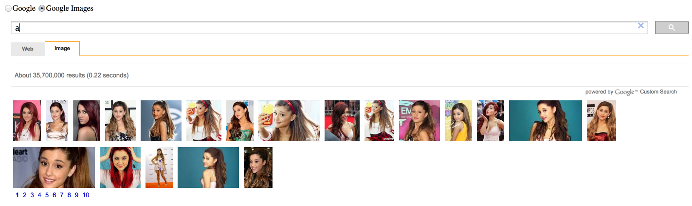
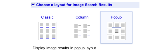
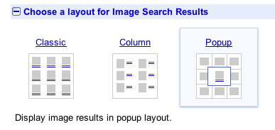
The new custom search is based on simple html tags and does not require javaScript knowledge. However, that makes it also harder to customize. Results can only be displayed according to a predefined set of layouts. The first iteration of this prototype utilises a default layout. Clicking on the tabs, users can search on Google Web or Google Images. These UI elements are all presets from the API.
Google Custom Search default layout
The radio buttons at the top of the page change the autocomplete suggestions. This turned out to be confusing, because the default tabs for the search output have similar labels. Also, the resulting layout, similar to a regular list of results, is not visually appealing.
Second Iteration
The new Search API does not provide access to the results as a structured database, which would make it easy to customise the visual output. The solution was to apply an alternative method:
Scrape the html elements from the page, through the document object model.
Erase Google’s injected html elements.
Store the addresses of the pictures.
The idea for the visual output was to display the images forming the letter typed by the user. To do that through an automated process, it is necessary to have a grid to position the images. This could be done by either:
Writing a preset of coordinates for each pixel of each letter.
Rasterizing a given letter and storing the pixels coordinates.
Though less precise, the second method seemed faster to develop. It was prototyped using Processing first, in order to evaluate its feasibility and visual result.
After that, this method was translated to the web page using P5.js [@p5.js], a javaScript library that utilizes Processing syntax. The process turned out to be laborious, though. There seem to be some flaws in the current implementation of the pixel manipulation methods in P5.
Besides, the images could not be loaded using the library, due to browser restrictions — see cross-origin resource sharing [@cross-origin] and P5’s developer Lauren McCarthy commenting on the issue [@loadimage]. The final prototype uses regular img tags, instead.
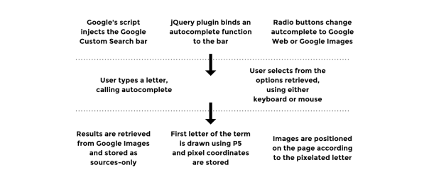
The script loops through a set of 20 images retrieved, positioning them according to the coordinates of the pixelated character. The following diagram sums up the technical process of this prototype:
User Tests
The second prototype was published online [@googles] and sent to two different users. Besides the search UI elements, the only information displayed was:
Title: “Google’s ABC”
Description: “The alphabet through Google’s autocomplete”
A question mark linking to a blog post [@thesis] that outlined the project and part of its process.
The feedback from the users can be separated in 3 categories, according to the problems they address: interactive, visual and communicative/conceptual.
Interactive
Lag when loading the results, made worse by the lack of feedback from the system.
Autocomplete not always responsive.
Radio buttons and autocomplete not working well together. Autocomplete options disappear after radio is selected.
Visual
Visual shapes not always forming recognisable letters.
Search box overlapping with letter, making some harder to recognise.
Communicative/conceptual
Message not clear. Comparing the results and critically thinking about them was only possible after reading the blog post.
Findings and Next Steps
The visual and interactive problems pointed out by the users tests were addressed in the last iteration of this prototype. Their solution was mostly technical and involved fixing some browser compatibility problems.
The communicative and conceptual problems, though, demand deeper changes for future prototypes. The interface is familiar enough to interact with, but its presumed neutrality does not seem to encourage comparison, on an immediate level, nor reflection as an ultimate goal. As for the entertaining purposes of this work, the lack of feedback is not conclusive.
Nevertheless, the technical aspects of this prototype point out to some interesting aspects of how the autocomplete works. An exploration of the letters for each service, Images and Web, reveals significant differences. The former is mainly composed of celebrities, as the latter seems dominated by companies. A more explicit comparison between the two could lead to more engaging interactions.
Because comparison and communication seem to be the main problems to address, these are possible next steps:
Compare different systems — Google services? Various search engines?
Iterate on ways to make comparisons visual.
Sketch visual solutions that to concisely communicate the goals.
Bibliography
“$.getImageData.” 2014. Accessed October 20. http://www.maxnov.com/getimagedata/.
“Aaron Swartz’s Art: What Does Your Google Image Search Look Like in Other Countries? Motherboard.”
“P5.js.” 2014. Accessed October 23. http://p5js.org/.
Paul, Christiane. 2007. The Database as System and Cultural Form: Anatomies of Cultural Narratives. na.
“The Dumpster: A Visualization of Romantic Breakups for 2005.” 2014. Accessed October 22. http: //artport.whitney.org/commissions/thedumpster/.
“[Thesis 1] Google ABC – Technical Module Prototype Gabriel.” 2014. Accessed October 25. http:// gabrielmfadt.wordpress.com/2014/10/20/thesis-1-google-abc-technical-module-prototype/.
“Top 15 Most Popular Search Engines October 2014.” 2014. Accessed October 22. http://www.ebizmba.com/ articles/search-engines.
“We Feel Fine / by Jonathan Harris and Sep Kamvar.” 2014. Accessed October 22. http://wefeelfine.org/. Whitelaw, Mitchell. 2014. “FCJ-067 Art Against Information: Case Studies in Data Practice.” Accessed
I’m trying to build a sort of Google ABC — an analogy between alphabet books and Google’s autocomplete engine. The idea is make people reflect about how this system works.
Besides, Google has been our default choice when searching for knowledge for the past years. Choosing an alphabet book as an analogy is a way of commenting on this.
This work is not finished yet, but here’s the process so far:
The old Google Web Search API and Google Images Search API have been deprecated as of 2010 and 2011, respectively. Though still functioning, they will stop operating soon and users are encouraged to replace them by the new Google Custom Search API. I started by implementing the search box using the new engine.
However, this API is actually intended to perform custom searches inside websites. The purpose of this project, though, was to search from the entire web using the Google Search engine. This is possible through a laborious process: by setting up a custom search with any given website, then editting your search to include results form the entire web, and removing the website you setup at first.
The main problem though was that the autocomplete did not seem to work for the “entire web” option. To sum up, it does not mimic the regular Google Search as I expected.
I found a Google Autocomplete “API.” It allows access to Google’s autocomplete results. However, it seems to be an engine developed for internal use, not really an API. There is no official documentation from Google.
After a few more searches, I found a jQuery plugin that allows for searches using various Google services, all through the same non-documented API.
Integrated the autocomplete plugin with the Google Custom Search bar.
Google Custom Search default layout
The new custom search is based on simple html tags and does not require javaScript knowledge. However, that makes it also harder to customize. Results can only be displayed according to a predefined set of layouts.
The solution was to scrape the data from the results, erase Google’s injected html elements, and store the pictures sources only.
Google Custom Search Layouts
I started working on a layout to display the results. My idea was to form the initials using images. To do so, I’d have to grab the letter typed by the user, draw it on a canvas and get the pixel results. I made a short Processing sketch to test the method first.
Processing sketch to draw pixelated fonts.
Because this small experiment seem to work fine, I decided to implement the page display using P5.js, a javaScript library that utilizes Processing syntax. The process turned out to be laborious, though. There seem to be some flaws in the current implementation of the pixel manipulation methods in P5. Due to browser restrictions — see cross-origin resource sharing and developer Lauren McCarthy’s comments on the P5 Github repository — the images had to be displayed as regular html elements.
City of Angels and Wings of Desire: Nicolas Cage might be the only connection between this prototype and ‘internet culture.’
This prototype is a visual comparison of sound and character lines from 2 movies: City of Angels and Wings of Desire. It is an attempt to:
* Apply Lev Manovich’s method from “Visualizing Vertov” to sound, instead of shots.
* Determine if/how patterns emerge from a sound analysis of a movie.
This analysis would be completely useless without data visualizer’s best friend: comparison. That’s the reason why I’m showing 2 movies instead of one. Choosing an European movie and its American remake seemed like a good comparison for insights.
How to read it The area chart shows the relative sound volume from each movie. Because I have no access to good digital copies of any of these movies, made no sense to draw a scale with absolute values.
The red rectangles above the chart show dialogues. I used data from subtitles to draw them.
The slider and play button work like in a regular audio player. Click here to access the prototype.
Browser compatibility * Safari: best results * Chrome: slow interface, but fully operational * Firefox: might not work
Also, bear in mind that the sound files from these movies are huge. I did my best to manage all sound loading events. Expect some delay before playing, though.
Notes
The process and reasons behind this prototype are documented in this presentation. In-depth explanations will be presented in the yet-to-come paper. I’ll update this post as soon as it is ready.
In this workshop, me, Daniel, and Gabor listed and discussed methods we found in our thesis research so far.
I described the method used by Lev Manovich in his article Visualizing Vertov. The paper applies some of Manovich’s techniques — direct visualization, cultural analytics – to visualize the works of Russian movie director Dziga Vertov.
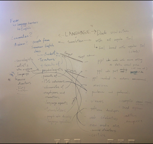
Yesterday we made a workshop to map the social aspect of our projects. We split into pairs and helped each other find the areas related to our work.
In the end, we should find common areas between the two. Because Evan‘s project and mine doesn’t seem related, we tried to link them by categorizing the areas instead.
The spreadsheet below is the result of our investigation:
Student
Evan
Gabriel
Subject
Fear. More specifically, the one derived from language barriers. Because the project is based on her own experience as an international student in NYC, she might narrow it down to English language problems.
Dada Visualization. Feel the need for new tools other than charts, to visualize data. So far his investigation has been through a movie editing tool he started to develop last semester.
The first people she might talk to is a group of students from an English class she met during Summer.
He might finish this tool and test it with people involved in producing experimental videos.
Target Users
students
video editors
Secondary Users
parents
people who post mashups on youtube
friends
viewers
coworkers
classmates
Experts
psychologists
data visualization researchers
sociologists
film and media researchers
linguists
sound engineers
ISS (International Students Services) advisors
computer vision experts
ESL (English as Second Language) teachers
critics
software developers who work with language applications
software developers
Analogous
translators
musicians
Artists
Movie directors whose work is about language problems
new media artists
In the end we found out that we share at least two domains: language and video.