Category Archives: Major Studio 1

News Timeline – Proposal

1. Idea
Build a timeline of the news about the brazilian protests. The web-based app will aggregate news from different brazilian sources since the first protests in March, 2013.

2. Context
The protests in Brazil began as public manifestations against the increases for transportation fares in a few cities. The demonstrations gradually grew to a national level, turning into the largest popular movement since the president’s impeachment in 1992. The demands of the movement also changed to include a larger scope of problems to fight against: corruption, police brutality, lack of basic infrastructure etc The media coverage during this process has changed from time to time — and also depending on specific companies — with contradictory opinions.

3. Goal
Besides documenting the news coverage of this event, my intention is to draw comparisons between different companies and periods. By analysing similarities and keywords, I plan to position the headlines opposed or close to each other.

4. Precedents
4.a. News Visualizations
Real-time Newsmap, Marcos Weskamp
newsmap

One Week of The Guardian, Dave Bowker
dave-bowker-one-week-of-the-guardian-saturday

Cascade, Jer Thorp / NY Times Labs
ca_zoomout

4.b. Real-time Feed/Web scraping Visualizations
We Feel Fine, Jonathan Harris
wefeelfine

4.c. Text Visualizations
Visualizing Poems, Diana Lange
diana_lange

Poetry on the Road, Boris Muller
poetry06_plakat

4.d. Text Visualizations/Comparisons
US presidential inauguration speeches: how does Obama’s second compare?
Santiago Ortiz
santiago

Acceptance, Luke DuBois

Missed Connections, Luke DuBois
missed_connections

4.e. Brazilian Protests Visualizations
Brazilian Protests Visualizations, Labic
labic

Causa Brasil, W3Haus
causabrsasil

Violence x Protest, Debora Leal (built with PageOneX)
pageonex

Protests by City, Date and Number of Participants, Wikipedia

Road Rage Controller

Authors: Gabriel GianordoliJamie Hong and Lucy Matchett

Assignment
Explore the interaction possibilities using a wheel game controller. The groups should create an app in Processing to create an interactive experience.

Idea
A road rage simulation without images. The computer would show a black screen only. All user feedback would come from sound.
There is an obvious association between the wheel and the subject. However, we thought that creating an aggressive app would provide an interesting contrast with the childish style of the controller.

Development
Personally, working on this project was very difficult to me. I haven’t yet realized how visual my works are — and how I depend on visual feedback to create. For the most part, I had the impression that I wasn’t creating anything! I’m glad it was a group assignment, I would never come up with a sound-only proposal myself!

Imagine – 3rd Iteration (Final)

Authors: Gabriel GianordoliJamie Hong and Lucy Matchett

1. Space
Strawberry Fields (John Lennon’s memorial in Central Park)

2. Observation
Most people would get to the place, take a picture of it and leave. Some would take a picture standing on the central mosaic.
The average time they spend there is really short. Because of that, the action one make ends up setting the “rule” for the next visitors.

3. Concept
During his later solo career, Lennon became famous for his political activism. Also, the lyrics from “Imagine” ask for people’s engagement, asking them to imagine a better and peaceful world. Those facts set the historical background of our project.
Although, the standard behaviour for his memorial — quick visit, take picture — seemed disconnected from that.
We wanted to stimulate interaction connecting those two contexts.

3. Idea
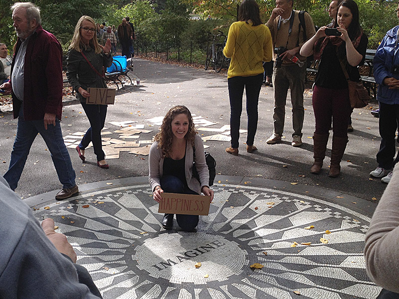
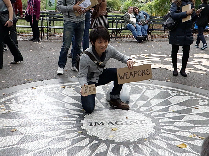
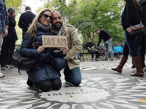
Cardboards with different words left on the side of the mosaic. Some words were taken from the lyrics, but we also added more verbs and prepositions so that people could make sentences. We’ve written some “negative” words as well: “weapons”, “greed”, “hunger”, “war” etc.
Given the number of foreign tourists, we included words from other languages in the last iteration.
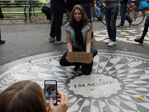
We were expecting people to take pictures with the words, within the mosaic or not. Our main goal was to help them make something of their own as well.

4. Parameters
Considering the first observation and the first and second iterations, we’ve set some fixed parameters for the installation:
– Cardboards not too close to the mosaic.
– Set up between 11 AM and 1 PM.

5. Final Iteration – October 19, 2013
5.a. Standard Word Set
For the first time, we went there on a weekend. That was a new variable in our system. Visitors seemed older than the ones on weekdays. That was a concern, because we’ve observed that most of the times a young female tourist starts the interaction.
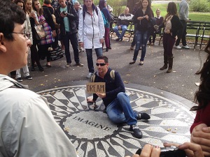
As before, we started by leaving one sentence along with the words.
It took 20 minutes until the first person picked up a word. After that, though, we had continuous and intense interaction for ate least 40 minutes.
Unlike the previous days, people took the words to the mosaic.
DSC00419 DSC00422 DSC00428 DSC00429 DSC00431 DSC00433 DSC00444 IMG_0337IMG_4381 IMG_4386 IMG_4387 IMG_4388 IMG_4390 IMG_4392 IMG_4395 Screen Shot 2013-10-20 at 6.39.11 PM Screen Shot 2013-10-20 at 6.39.34 PM Screen Shot 2013-10-20 at 6.39.44 PM Screen Shot 2013-10-20 at 6.40.13 PM Screen Shot 2013-10-20 at 6.40.22 PM Screen Shot 2013-10-20 at 6.41.05 PM Screen Shot 2013-10-20 at 6.41.10 PM Screen Shot 2013-10-20 at 6.41.15 PM Screen Shot 2013-10-20 at 6.41.20 PM Screen Shot 2013-10-20 at 6.43.22 PM Screen Shot 2013-10-20 at 6.43.54 PM Screen Shot 2013-10-20 at 6.45.44 PM Screen Shot 2013-10-20 at 6.46.37 PM Screen Shot 2013-10-20 at 6.46.47 PM Screen Shot 2013-10-20 at 6.47.12 PM Screen Shot 2013-10-20 at 6.47.23 PM Screen Shot 2013-10-20 at 6.47.40 PM Screen Shot 2013-10-20 at 6.48.48 PM Screen Shot 2013-10-20 at 6.50.04 PM

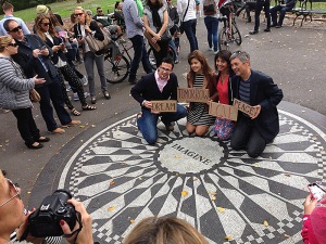
That last picture was probably the only time when people didn’t turn the negative words into something positive.
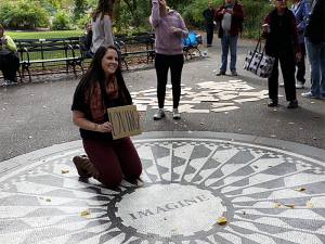
Some people would also take pictures outside of the mosaic or make sentences on the ground, like in the previous interactions.
IMG_4391 Screen Shot 2013-10-20 at 6.48.17 PM

5.b. Foreign Languages
The cards using other languages were used as well.Screen Shot 2013-10-20 at 6.44.57 PM IMG_4393

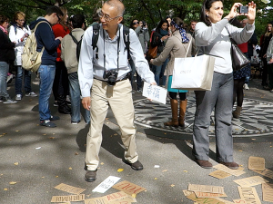
5.c. System Interference
After that, a man left his CD and some promotional material on top of the words.
IMG_4399

We left it there for a while. It was interesting to see how that completely changed the system. People assumed that the installation had some purpose related to the CD. Not even they wouldn’t pick the words anymore, but also they stopped taking pictures.

5.d. Unexpected Interactions
Our foreign language cards included just a few idioms: italian, portuguese, spanish, french and japanese. We’ve chosen those languages based on observation, but we didn’t have any quantitave data about the percentage of tourists from each country.
After some time looking at the cards, a girl started writing words in hebrew on the back of them.
DSC00455

5.e. System Permanence
Since we were done with the project, we decided to let the cardboards there. On the next day, looking for pictures from Strawberry Fields published on Instagram, we found that people continued to use the boards.
6ea7934c398211e3821b22000aeb0baa_8 42104d64390b11e3939b22000a1f9251_8 ae3bb17c390111e3b87b22000aaa07f6_7 c3f0be8e390311e3a19522000a9f126b_8
ac6b5efe39c111e3836722000ab5c7f3_8

6. Conclusion
We think that the installation was successful due to some key factors:
– It was built on top of a pre-existing behaviour.
– It doesn’t go against user’s preset goals.
– It relates to a historical background known by its users.
– It is malleable, there are no preset rules.

Those factors also make it able to restart itself. At least in a short-term, it is capable of having a life of its own.

Imagine – 2nd Iteration

Authors: Gabriel GianordoliJamie Hong and Lucy Matchett

Prototypes
For the second iteration, we made more cardboards with words. We used the lyrics as a starting point and tried to add some connection words as well. We also put some negative words to see if people would make sentences out of the “imagine mood”.
We tried to draw the words as varied as possible, so that the previous ones would also fit into the group.

12:45
We went to Strawberry Fields a little sooner than before, around 12:45. There was more people by that time.
Another noticeable change to the system was a message asking for blood donors for the “Strawberry Fields Mayor”. It was facing the exact angle tourists used to take their pictures. We notice that they were taking pictures from a slightly different angle to avoid it.
DSC00249

1:00 PM
We began by setting up the words on the side of the circle, not close to it. We didn’t use the “free lyrics” sign.
At first, people would just stare at it and take pictures.
DSC00255 DSC00267

1:15 PM
We made two sentences in the same place: “Living for today” and “Sharing tomorrow with love”. After a while, people started to make their own sentences and taking pictures of it on the floor or holding the cardboards. Most of the people who interacted were female young tourists.
DSC00277 DSC00284 DSC00290 DSC00297 DSC00306 DSC00314 DSC00324 DSC00326

By that time we noticed that the system was working perfectly well on his own feedback.
More people led to more interaction.
After some, though, it stopped. People’s flow in the place is fast. They don’t stay there for a long time. Because of that, they tend to repeat what people were doing by the time they got there. Having few people seemed to reset the system.
Also, if the cardboards are arranged in a way that you already have too many sentences, people don’t feel like they are allowed to change it.

14:15 PM
We left to have lunch.

14:30
When we got back, it didn’t seem to have significant changes.

14:40
We rearranged the words. As usual, it prompted more interaction and people made a few more sentences.
IMG_4295

15:15
We rearranged the words and put them closer to the circle. We also left a sentence inside of it (“all the people”).
Though some people took pictures inside of the circle with the sentence there, they didn’t interact with it. It didn’t last long there.
DSC00331

15:30
We left another sentence inside of the circle. It lasted for less than 30 seconds.
DSC00340 IMG_4320

Even so, some people took pictures holding the words and standing inside of the circle.
IMG_4321 DSC00349 DSC00346 DSC00343

Conclusion
We felt that the intervention works better by itself, standing on the side of the circle. There are several reasons for that.
First, taking a picture of the memorial is the primary goal of the people that visit it. Even though some people may find interesting hold some kind of message, most just don’t want their picture spoiled by some words written in cardboards.
Second, it takes time to find the words and make a sentence. While in the center of the circle, most people just try to take their picture as fast as possible, so that the others don’t have to wait for a long time.
Third, the rules of the place are controversial for tourists. Some argue that you are not allowed to step on the circle, while some other lay down on it to take a picture. Adding another element to that increases the noise in the system.
At last, we had the impression that people are more in the mood for interact with something early in the afternoon. It seemed like people around 4 PM were just checking another place in a long list of must-visit spots and had no much time to stay there.

Next Steps
We think that we got the interaction we wanted so far. People took the words, made sentences, took pictures of it — and even talked to strangers asking them to take pictures of them. It turned out to be slightly different from the initial plan. At first, we wanted people to make sentences complementary to the “imagine” word inside of the circle. That didn’t happen, but it is working.
The system reset is still a little problem. We are going to try to add some more triggers to the system, like using different languages and hashtag symbols.

Imagine – 1st Iteration

Authors: Gabriel GianordoliJamie Hong and Lucy Matchett

Concept
Exploring how we can get the public to interact with the space in a more interesting way and alter this already set behaviour of the way in which they interact and take their photographs.
The way in which we have decided to explore this is very much in the theme of John Lennon’s message of sharing in love that is expressed in the song “Imagine”. Allowing the people that are interacting with the space to share their message of peace and love through the use of his lyrics and personalizing their photographs/ experience.
This will be done through producing a number of different boards that will have different lyrics of the song Imagine written upon them, and created in such a way that it encourages the public to arrange them in relation to the Imagine text to create their own version of the song and message, which they can include in their photo.

First Iteration – October 10, 2013
For the first Iteration our goal was really just to see if people would even interact with the boards in any way shape or form. As we noticed in previous observations that tourists and other people in the space were very cautious with the way in which they interacted with the space, as though they were uncertain as to what they were allowed to do.
So we begun by creating the boards out of cardboard in a very crude mock-up, and just included lyrics from two alternate verses.
img_01

First off we set up the lyrics to the side of the mosaic so that people walking through the space would see the set up before they got to the memorial. Our goal was just to see if anyone would take notice.
From the get go there was interest as people stopped to take pictures and read the boards. Most people were hesitant to actually interact with the boards.
We did however get one girl who interacted with the boards in their current position and rearranged them so that they made some sort of sense.
Which was interesting because after she made these changes less people were actually going up and touching the boards but just taking pictures. So this feeds into the whole law of interaction where in people feel compelled to correct or rearrange something that isn’t quite right. Which is an important behaviour to note when it comes to this project. So we rearranged them back to not making logical sense and then we got a little more interaction.
IMG_0164

Next we wanted to see what would happen with the boards when they were in direct contact with the mosaic. We wanted to see if people would move them or just leave them within their pictures and if people would even attempt to change anything.
For a while people just left it how it was and started taking their pictures with it and just pictures of the mosaic in general.
We heard some people commenting on the fact that “They have all the lyrics over there”. So there was understanding about what the boards were, probably people were just a little cautious in terms of they weren’t sure what they were allowed to do.
We did however get the kind of interaction we had hoped for when this man. Swapped out the lyrics from “Living life in peace” to “Living for today”.
IMG_0205

This was really exciting because it was exactly what we wanted to happen and required absolutely no prompting what so ever. So the potential for this idea to work is definitely there!

Next Steps
Now that we know the boards will work and people will pay attention to them there is just some tweaking we need to do to push the idea further forward and get more people interacting the way we want them to. Some possibilties to explore:
– Replicate the font of the mosaic and attempt to create a tile pattern for the final boards.
– Include different languages and translations of the lyrics, as it is a tourist spot and could get those non-English speaking people to interact with the space as well.

Some Things we’ll definitely do:
– Create more lyric boards and maybe include other words too so people can make their own wishes for the future and the peace.
– Explore scattering the words around the mosaic and above it to see if that changes the type of interaction and behaviour.

Imagine – Observation

Authors: Gabriel Gianordoli, Jamie Hong and Lucy Matchett

After some attempts observing corners, we’ve finally chosen what seemed to be an interesting place for the Instruction Set for Strangers project.

Space
Strawberry Fields (John Lennon’s memorial in Central Park)

Physical Elements
– 3 paths meeting in a common space
– Benches surrounding
– Mosaic memorial in center of space

IMG_4373 DCIM100GOPRO DSC00207

Observation Summary – October 8, 2013
– Tourist attraction.
Already a standard set of behaviours with the space; take a photo with the mosaic and then leave.
People follow other people; the first person to take a photograph sets the standard “rule” for the next people who take their photos. For instance, if someone is standing or sitting in the circle majority of other people will follow this example for their photo.
– Varying different ways in which people pose with the “Imagine” mosaic.
– Sitting within the mosaic circle.
– Staying out of the circle (cautious to stand on it). Not everyone is sure if they are allowed to step on it.
People don’t stand for a long time in the place. That’s why the “rules” may change from time to time.
– Always same direction/angle so can get “Imagine” in a readable way
– People leave things on the mosaic.
– Some people will move these things for their image they want to take. But then replace.
– Some leave what ever is there in a respectable way. Even if they accidentally kick something they will replace.
– Relatively regular flow of people.

DSC00198

Notes
We’ve done a first “pre-iteration” before leaving the place. We’ve put some of the roses that someone left there covering the “Imagine” word. After a while, a woman took them away.
Untitled-1

It seems that anything above the circle would be rejected almost immediately because:
a) It may spoil people’s picture.
b) It may seem disrespectful.

We were especially concerned with the second one. We decided not to try anything that could be interpreted as a negative thing.


7in7 – 07 – “Invisible Cities”, Fedora

The Story
Inside of a palace in Fedora, there are several miniatures of the city. Each one is a city design that wasn’t built. Before it was ended, the city had changed already.

1. Sketches
I thought that the best way to represent Fedora was with prototypes. Like the city, they would always be the planned and unfinished version for a bigger project.
I started working once again on the book structure. I imagined an app version of Invisible Cities and drew some quick sketches of its table of contents:

sketch

I picked 3 of them to build paper prototypes.

2. Prototypes
I build 3 screens for each prototype. They would show basically the same features, visualized in different ways: the complete list of chapters; the chapters filtered by number; the chapter filtered by theme.
I made them using my notebook pages to simulate an iPad-like size, though they are slightly smaller. I also tried to color code the chapters.

IMG_5152
IMG_5169 fedora_v1a fedora_v1b fedora_v1c fedora_v2a fedora_v2b fedora_v2c fedora_v3a fedora_v3b fedora_v3c

3. Final
With the prototypes finished, I tested them with my wife. We shot a video of the section.

4. Notes
None of my prototypes worked. They are all an epic fail. If I had to change any of them, I wouldn’t even know where to start. My assumptions about the navigation were clearly wrong, and I have the impression that I made something simple complicated.
However, this last project was about prototyping — and failing. Considering that, I wouldn’t change anything.

7in7 – 06 – Invisible Cities, “Zobeide”

The Story
Zobeide is a city built by men who had a dream of a woman escaping them. Retracing the route of their dreams, they end up building a trap — for dreams who already escaped them.

1. Sketches
Zobeide’s metaphor reminded me of São Paulo. That made me ask myself how many of my friends moved to there in search of something? How many of them achieved their goals?
To answer that, I created a simple Google Form, with only 2 questions:
1. What did you want to achieve when you moved to São Paulo?
2. Did you achieved this goal?

Screen Shot 2013-09-16 at 4.30.21 AM Screen Shot 2013-09-11 at 4.23.40 PM

After 64  answers, I started to plan my visualization. First, I tagged the data in order to get any conclusion out of it. I found 6 categories: work, friends, relationship, study, personal development and attractions. Since there was not a limit, one answer may related to more than one tag.
Then I started coding, back to Processing again. My first idea was to display a bar graph showing each tag and its count. The percentage of yes/no would be displayed in the same bar, using color/gray.

layout-02

While still working on the code, I realized that this was not the best approach for the visualization. Reading the answers was important, too. So I changed it to:
– Large donut showing the total percentage of yes/no.
– Bar graph for tags and counts.
– Text area to display filtered answers (by tag or yes/no).

layout-01

3. Final
I think that this is the most complete visualization of all 7 projects. Maybe because I learned a lot with the previous ones and didn’t have to struggle with basics — except for this scrollbar I had to code from scratch.
Its main feature is certainly interaction: you couldn’t show all responses or filter them in a printed page.
Working online here.   Screen Shot 2013-09-16 at 4.57.01 AM

4. Notes
Though I am happy with the interaction in general, I think that clicking once again to deselect an element may not be clear for everyone. If I had more time I would also make it look better, maybe put some more colors.
At last, I would also translate the answers.

7in7 – 05 – Invisible Cities, “Despina”

The Story
People can reach Despina by the sea or the desert. For each option, the city seem different: from the sea it looks like a camel; from the desert, a ship.

1. Sketches
My attention to this chapter was drawn after I read this sentence from the Wikipedia page about Invisible Cities:
“The book is structured around an interlocking pattern of numbered sections, while the length of each section’s title graphically outlines a continuously oscillating sine wave, or perhaps a city skyline.”
That analogy seemed to fit perfectly the city’s concept. Also, it would give me a chance to work on a visualization about the book structure. So I started to look for this pattern in the titles. The weird thing is that the american titles really seem to draw this curve — except for a slight detour in “Continuous Cities”. But, if that was in fact Calvino’s idea, why don’t the italian titles show the same pattern?

Screen Shot 2013-09-16 at 3.30.28 AM Screen Shot 2013-09-16 at 3.30.25 AM

I also tried to look for it retaining only the themes (“memory”, “desire” etc) instead of the whole title (“Cities and Memory”, “Cities and Desire” etc). It didn’t work either.
At last, it seemed to be even more appropriate for a story. People see patterns everywhere, and they they usually have more connections to their own thoughts than to the object itself.
My idea then was to visualize the book structure as an abstract pattern, pretty much like Stefanie Posavec‘s works once again. I decided to make a physical object, because:
– I couldn’t stand coding for 5 days without stop.
– I missed paper and pens.
– One of my constraints was “interaction design”, not “digital design”.

I bought acetate and permanent markers. I knew, yet vaguely, that it would be made of transparent sheets so that the user could change the patterns. I started working on Illustrator, though:

Screen Shot 2013-09-11 at 5.58.12 PM

In fact, there is a rigorous structure in Calvino’s book that ends up drawing a pattern — though it is not a skyline. I started drawing a sort of abstract bar graph, using different colors and heights to display each chapter and theme.

despina_v2_01-01 despina_v2_02-01 despina_v2_03-01 despina_v2_04-01

2. Prototypes
Finished with the pattern, I started to test how it would work with actual acetate and ink:

IMG_0270 IMG_0280 IMG_0279

I decided to make the keep the sheets separated, instead of using some binding. That would keep a bigger combination of patterns. I drew a grid in my notebook and began painting the bars, using the Illustrator mockup as a guide. I also made an acetate box to make it feel like a single object:

IMG_0307 IMG_0284 IMG_0296 IMG_0292 IMG_0304 IMG_0311

Works fine as photography filters as well!

4. Final
I was happy with the final result. The transparency allows for the combination of different patterns. The colors produce a great effect:

IMG_5228 IMG_5240* IMG_5241* IMG_5282 IMG_5298 IMG_5269 IMG_5303 IMG_5252 IMG_5250 IMG_5248

4. Notes
If I had more time I would design a better box. This one probably won’t last longer.