This is the last post on this blog! I’ve documented my work at the MFA in Design & Technology at Parsons, from 2013 to 2015, on it. Feel free to explore the projects here.
To see my professional work, go to http://gianordoli.com/
best,
This is the last post on this blog! I’ve documented my work at the MFA in Design & Technology at Parsons, from 2013 to 2015, on it. Feel free to explore the projects here.
To see my professional work, go to http://gianordoli.com/
best,
Presented Thursday, December 4th. Slides here.
 I’m trying to finish this “ribbon drawing” tool. It is now stable, allowing users to add, reset and erase the shapes. I also added some new physics simulations (attraction, wind) and fixed others — springs are stable and oscillation can interact with other simulations.
Finally, I added the option to “playback” the drawing and record everything as a png sequence — so people can use it to make videos.
Github repo here.
1. Changing direction based on mouse movement.
2. Reading pixels from camera and changing direction of vector field based on their brightness.

3. 3D vector field with Perlin noise. The skecth is pretty buggy, though. I wasn’t able to add a camera nor particles. Any simple change makes it crash.
Github repo here.


In digital systems, we access information through databases and software. Graphical interfaces make this process easy and almost invisible. But also might lead to false assumptions and misconceptions derived from the lack of knowledge of the systems we engage with.
This project is concerned with the relation between users and information mediated by software. It will explore how the process of gathering information from databases is shaped by the algorithm that drives it. How much do we know about systems we use daily? How aware are we about possible biases in data retrieval?
This project aims to provoke reflection on our relationship with online sources of information. Though it might make use of online databases, and retrieve data from them, its main concern is information. Therefore, a distinction between the 3 terms is necessary.
In this project, the term database defines any system of information, not restricted to a digital format. As researcher Christiane Paul points out, “it is essentially a structured collection of data that stands in the tradition of ‘data containers’ such as a book, a library, an archive, or Wunderkammer.” [@paul_database_2007]
Data, as a consequence, is the content of the database, no matter its nature — image, text, or number. At last, information, often referred to as “processed data,” is understood in this project as a piece of content (data) that has been through a process of analysis or interpretation. New media artist and academic Mitchell Whitelaw defines data as “the raw material of information, its substrate”, whereas information “is the meaning derived from data in a particular context.” [@whitelaw_fcj-067_]
Given that the production and circulation of information is the main concern of this project, it is inserted in the field of information arts. This practice is defined by Christiane Paul and Jack Toolin as works that “explore or critically address the issues surrounding the processing and distribution of information by making information itself the medium and carrier of this exploration.” [@paul_encyclopedia_]
Considering that this work utilizes algorithms to process digital information, there is an overlap between information arts and digital, or new media, art. However, both the subject and medium of this project refer to information. Digital media, on the other hand, is only a part of the techniques here employed. Therefore, the category information art will be adopted instead of digital or new media art.
This project is the first one of a series intended to provoke discussion on our use of online sources of information. The series is defined by a set of rules:
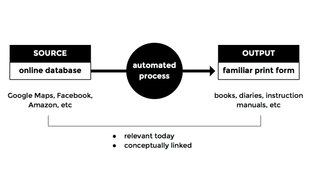
Paul and Toolin present a diagram that outlines the general practice of information arts. In this model, the work can either be finished in the stage of information, serving as a new data source, or generate a database or visualization that will then be redistributed. The latter is the case of this project, which will reorganize the data source constructing a new database and then translate it into new forms of communication.

The printed media is utilised in this project as a communication device, for its capacity to evoke cultural meaning embedded into its familiar forms. ABC books, for instance, are directly associated with education, children, language, no matter how diverse their formats and content.
The translation from digital to print also serves the purpose of creating an uncanny effect. Though both online content and printed media must be familiar, their displacement should generate an odd hybrid form. In addition, this process helps bring focus to the dataset, by removing it from its original UI. For example, a comparison of all Google’s autocomplete suggestions from A to Z would not be possible through the search box, because it retrieves results one at a time.
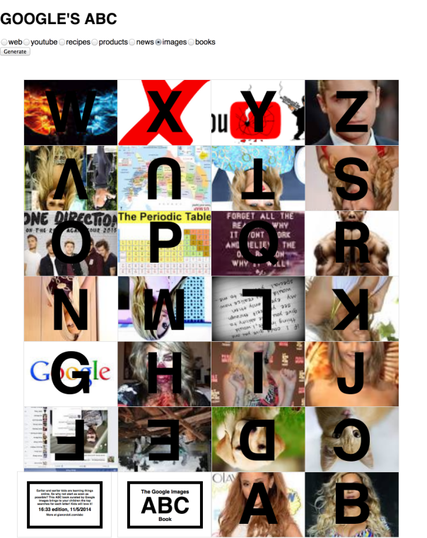
“Google’s ABC,” the prototype described in the previous paper, did not allow users to easily compare the autocomplete suggestions accross different services — Google Web and Google Images, in that case. This new prototype, “Google’s Supersearch,” was developed in response to that, and allows users to compare autocomplete suggestions from 7 different Google services: Web, Youtube, Recipes, Products, News, Images, and Books.
However, this prototype is not conceptually linked to the series outlined in the methodology section. Most of the questions it tries to answer are technical: what Google services offer access to their autocomplete suggestions? Is it possible to retrieve their results without using any API?
In their paper “What do Prototypes Prototype?,“ Stephanie Houde and Charles Hill proposed a model for categorizing prototypes according to their functions. [@houdc_what_1997] Based on that, “Google’s Supersearch” is considered here an implementation prototype, since most of its questions are related to technical aspects of a larger project.

“Google’s Supersearch” has a simple functionality. As users type in the search box, the page displays autocomplete suggestions — from each of the 7 different Google services — as lists into separate boxes. The options are clickable and redirect to a Google search page with the results for the selected term. For example, clicking on “chicken dance” under the Youtube list redirects to an youtube search page with all the results for “chicken dance.” This is achieved using the same Google Autocomplete undocumented “API” [@google] employed in “Google ABC.”
The interface is minimal and has no symbolic associations — the ABC metaphor was removed from it. The only text displayed besides the title and the results is “What does each Google service suggest you?”
The prototype was received by users as a rather practical and useful application, capable of aggregating different functions from Google in a single place.

The design questions addressed by this prototype were related to the communicative aspects of the project. First, do people recognise it as an ABC book? Do they understand it is intended for children? Second, what do they think about the use of autocomplete suggestions an educational material? Do they perceive any critical message?
The prototype was made by storing the top autocomplete suggestions for each letter, using Google Images. After that, images for each term were searched and downloaded. Then the book was designed in Adobe Illustrator, using one of the many layouts for instant books described by Esther K. Smith in “How to Make Books.“ [@smith_how_2007] It was printed in a single sheet of paper in letter format. This layout does not require any binding or advanced tools besides scissors and glue.


The back of the book displays the time and date of that edition, along with the following lines: “Earlier and earlier kids are learning things online. So why not start as soon as possible? This ABC book curated by Google Images brings to your children the top searches for each letter! Kids will love it!”
The response to this prototype was positive, in general. Though some people did not understand exactly how the content was being generated, the critical association between the online source and the print form was clear for most users. Some even stated that giving kids those books could be an interesting experiment, since the celebrities present on it were well-know even for children in an early age. This was a positive outcome of the user test, since the intention of this project is not to point out negative aspects of technology, but instead provoke discussion and reflection.

This prototype combines technical aspects from both previous ones. Its online presence utilizes the same undocumented API [@google] used to retrieve autocomplete suggestions from various Google services. The layout is set so that users can print the page, cut, fold, and make an instant book exactly like the one described in the previous section.
Accessing and manipulating the images was the most challenging part of the development of this prototype. As described in the previous paper, the new Google Custom Search [@custom] does not allow for customization of the results layout. Also, the Google script that receives and displays the images on the page runs on the server side. Therefore, it is not possible to manipulate the images with a script on the client side directly.
On previous prototypes, a quick fix was to use the official custom search and then scrape the results from the page to manipulate them. That would be laborious and not effective for the current prototype, in which 26 searches need to be performed in sequence.
The solution was to use a web scraper running on the server side. The way it works is by emulating a client visiting an url, in this case 26 Google Images pages, one for each term. Then a script grabs the first image from the results and send it back to the client. This was achieved using node.js, a server language based on javaScript syntax, with a combination of modules for web scraping and connecting client and server.
Once that problem was solved, the basic layout was designed, aimed to make the page ready for print. It was achieved through a combination of CSS rules and javaScript.
Some iterations at this point included sliders to change the colors of pictures and letters. This was an attempt to solve the contrast problems, but was discarded to avoid adding extra steps to the generative design process. Instead, the version sent to users displayed the letters in black, with a white outline.


Technically, the prototype works as follows:

The prototype was sent as a web link (http://54.204.173.108:3011) to 22 people, from which 10 sent a response. Only a few had a general idea of the concept, and most of them have not seem the printed prototype first. People were invited to participate through email or in person. Because different aspects of the project were being tested at once, no guidelines were given on what to comment.
The main areas on which this prototype focused were:
As for the look and feel, it was only partially addressed. The default html styling adopted is far from representing a definitive visual design for the project. Although, the basic wireframe, with the process split into 3 steps — source selection, printed form, and tutorial — was meant to be final.
Up until it was sent to the users, this prototype has been running on a local server, with no major technical problems. That was not the case when it was published on a remote server, though.The time for scraping and loading the images went from less than a minute to about 5 minutes. This had a drastic effect on the user experience. Some participants responded immediately expressing their concern and some ended up not taking part in the test at all.
Technical adjustments were made and the prototype was updated in less than 12 hours after the invitation. In the new version, it takes about 2 seconds to load the first image and 15 to 20 seconds to load all 26.
Once this problem was solved, the responses from the participants did not point out other technical problems. The information gathered after that can be grouped into 4 areas: communication, experience, layout, and instructions. Each one was also split here into feedback and suggestions — except for the first, for which users did not suggest any direct change.
Some of the responses to the communicative aspect of the project were contradicting. Most people understood the project as somewhat critical, though not sure about its precise intention. That is not a major concern, because leaving room for interpretation and discussion is part of the goal of this project.
As for the problem with the instructions, it can be easily addressed through the use of video or moving images, as suggested in one of the responses.
After the test, some of the users were presented to the printed version of the prototype – none of them printed it from the page. The responses were all positive, as opposed to their opinions about the web page layout. This was an unexpected an yet reasonable problem: since the page was developed as a simple bridge through the source and the print output, not much thought was put into the online experience. As a consequence, if users do not print it, their experience is limited and frustrating. Therefore, experience and layout are the areas that demand deeper and most immediate changes for the next iterations.
The next steps of this project will conduct two simultaneous investigations:
“Custom Search — Google Developers.” 2014. Accessed October 17. https://developers.google.com/ custom-search/.
“Google Autocomplete ‘API’ Shreyas Chand.” 2014. Accessed October 17. http://shreyaschand.com/blog/ 2013/01/03/google-autocomplete-api/.
Houdc, Stephanie, and Charles Hill. 1997. “What Do Prototypes Prototype?” http://www.itu.dk/~malmborg/ Interaktionsdesign/Kompendie/Houde-Hill-1997.pdf.
Paul, Christiane. 2007. The Database as System and Cultural Form: Anatomies of Cultural Narratives. na. http://visualizinginfo.pbworks.com/f/db-system-culturalform.pdf.
Paul, Christiane, and Jack Toolin. 2014. “Encyclopedia of Library and Information Sciences.” Accessed November 26. http://www.tandfonline.com/doi/abs/10.1081/E-ELIS3-120043697.
Smith, Esther K. 2007. How to Make Books: Fold, Cut & Stitch Your Way to a One-of-a-Kind Book. 1St Edition edition. New York: Potter Craft.
Whitelaw, Mitchell. 2014. “FCJ-067 Art Against Information: Case Studies in Data Practice.” Accessed September 22. http://eleven.fibreculturejournal.org/fcj-067-art-against-information-case-studies-in-data-practice/.

This project can be accessed here.
Idea
An ABC book based on Google’s Autocomplete. Suggestions for each letter are automatically retrieved and may vary depending on the service selected by the user — Images, Books, youtube, etc.
The layout is set so that users can print the page, cut, fold, and make a (physical) instant book.
Concept
We spend our lives engaged with data systems, though we see them only through graphical interfaces. Even so, we don’t know much about how they work and why they came to be this way. This project is part of a series of experiments that try to shed a light on this issue, making people think about their relationship with online sources of knowledge.
The idea of printing an ABC book out of Google’s Autocomplete suggestions creates an odd juxtaposition: though these 2 things are familiar, they’re not meant to be together. Even so, they both constitute relevant sources of knowledge today.
More information about the series can be found here.
Iterations
This work is a sequence of 2 previous projects:
* Google ABC
* Google Supersearch
The iterations of this particular one were as described below:
1. User input limited to the selection of service.

2. Color effects on the pictures. User could choose foreground and background colors. This was an attempt to solve the visual contrast issues.

3. Content edited as a step-by-step tutorial. Functionality to print added. Also added instructions on how to make the physical book.
Technology
The project runs as described below:
* User select service. A script runs through the 26 letters of the alphabet and retrieves autocomplete suggestions for each letter using a Google non-documented API. (See design brief #3 for details).
* By hitting ok to confirm, the user triggers the instant book layout. This one is achieved through a combination of css rules and javaScript.
* After the layout is complete, the page calls a web scraper, sending the suggestions stored in the first step — ‘Ariana Grande’ for A, ‘Beyonce’ for B, etc.
* The scraper runs on node.js, some node modules, and phantomjs. It loads a Google Images page searching for the term sent by the client — ‘Ariana Grande,’ for instance.
* The scraper stores the address of the first image result and send it back to the client.
* The image is appended to its position, above the initials.
* If ‘print’ is hit, a new html page is created and the html from the book is sent to it.
This project allows users to compare Google’s Autocomplete suggestions from 7 different Google services: web, youtube, recipes, products, news, images, and books. As users type something on the search box, the page displays the suggestions as lists into separate boxes. The options are clickable and redirect to a Google search page with the results for the selected term. For example, clicking on ‘chicken dance’ under the youtube list redirects to an youtube search page with all the results for ‘chicken dance.’ The purpose is to demonstrate how little we know about simple features we use everyday — in this case, it shows that Google’s autocomplete suggestions are different for each Google website.

This project retrieves information from Google’s autocomplete — more specifically, from 7 different Google services.
One thing that wasn’t much clear on the previous prototype, is that autocomplete depends on the service you’re using — Youtube, Images, Web, etc. I found this interesting and built something that allow people to compare these suggestions in just one page.
By clicking on the links, users are redirected to the search results of that term.
Jer Thorp defines his works as ‘software-based’ and ‘data-focused.’ He is the co-founder of The Office for Creative Research, along with Ben Rubin and Mark Hansen, and teaches at NYU’s ITP Program.
Some of his works pre-OCR include the algorithm for the 9/11 Memorial and Project Cascade. The latter was developed by Jer as a Data Artist in Residence at the NY Times R&D Group.
I talked to Jer for about 40 minutes. I didn’t conduct a formal interview. Instead, we talked about some of my ideas for this project and things he was working on. I tried to expand this to a conversation about broader themes in the field as well — future directions for data visualization, the role of data art, cultural changes related to data, etc. That is why this transcription doesn’t follow a Q&A format.
On the idea of ‘direct visualization’ as a form of representation closer to the artifact (the thing itself)
That’s a philosophically very deep question. You can get closer to the measurement, but it’s very hard to get close to the thing. That requires you analysing not only the act of representation, but you have to also consider the act of measurement, you have to consider the intent of the measurement, it’s all built into it. In that case [Manovich’s film visualizations], I would consider the dataset this kind of analytics that’s running on the images. There’s a lot of decisions being made there.
On the limitations of algorithmic-based cultural analysis
There’s this myth that the computer and algorithms allow you some type of purity. That is not true at all. This analytics allow us to do things we’ve never been able to do before. But they also don’t mean that we can dispose of ethnographical and the old-fashioned ‘talk to people,’ and do some journalistic research and so on. [Cultural analytics] It’s a tool, and a very powerful one. But it needs to be paired with other pieces.
About 3d (sculptural) visualisations versus 2d, in terms of perception
Scale and perspective make a huge difference for everything. I’m skeptical about those studies though, because if you dig up the papers half of them were done with a group of about 20, almost all white, grad students. And then we build all of our decisions based on them.
For us [OCR], it’s all about communication, which is a different thing. David Carson has this famous quote: “don’t confuse legibility with communication.” Because most of the times in our projects our fundamental goal is not to allow people to see “this is 6.8 or 6.2,“ but instead to give them a way to interpret that, or to have a feeling about it, or to construct a narrative from there. Of course rigour is important, so we’re not gonna show things in a way that is misleading. But I don’t believe in best practices in that sense. What’s best practices for your magazine might not be best practices for another magazine. And what if I’m projecting on a wall on a building, or what if it’s a sculptural form? These are things that we have no rules for, which I think is why I like those things more.
About future directions for the data visualization field
We’ve been working a lot with performance, and trying to think what that means perform data. We’re doing a long residency with the Museum of Modern Art. It’s an algorithmic performance that we write the scripts for actors that perform them in a gallery. It’s very much like traditional theatre in a way, but the content is generated using this data techniques we developed. That’s pretty interesting to me.
I think sculpture, data in a physical form it’s still in its infancy. Most of the works we’ve seen in the past 6 years look like something you just pulled out of the screen and plotted on a table. A lot of them look like a 3d renders, because of the 3d printers. There’s a ton of possibilities that haven’t been explored. We think about shape a lot in sculpture, but we don’t think a lot about material, its relation to the body or to a room, architecture, design, temperature… There’s a ton of room to do interesting things in that department.
On the reasons for a large number of recent data-related projects
Something about this movement has to do with something that’s happening in culture. It’s about and around this kind of data-based transformation that’s happening in the world. So it’s less about how it’s being done and more about why. It’s about the NSA, radical changes in transparency, wearable sensors, all those things coming together in this really big cultural change.
I’m definitely skeptical about the advertising slogans that have been used to promote this stuff, but I’m optimistic about its potential. Last year was really interesting, because for the first time we started to have real conversations about the exclusionary nature of big data. What does data mean for underprivileged communities? What decisions have been made based on a completely white North-American frame of thought? And how can we do better? That to me is really exciting.
The work we do here and the work that are a lot of people are doing is fundamentally about trying to push a cultural change on how we think about data. And that is gonna take a long time, it’s probably gonna require a lot more than a 9-person studio pushing against it, but what we need is a generation of people who understand data and collectively can make decisions.
Most people don’t even have a good understanding of what is data. And it’s fundamentally easy to talk about data as measurements of something. If you want to be more accurate, you can say it is records of measurement of something. And it’s important to include ‘measurement’ in it because it is a human act. So it is a human artefact. We can program machines to do it, but they’re still doing it based on our decisions — until A.I., strong A.I. development there’s no data that is not fundamentally human data.
This interview was made in a previous phase of my project, when my main questions were about representation — how to get close to the thing, or the artifact. It had some impact on my later decisions, leading me to turn my focus to the process instead of the result. In other words, if every data visualization process is based on decisions and implies lossy, is it possible to make it transparent? Can data visualization lead to a better understanding of data itself?


