Data
Changing to javaScript took me a while to load the data. I ended up using node.js and a specific module to read csv/tsv files. An then I translated the same parsing I have written in Processing to javaScript.
Sketches
A) I started to experiment with the visual representations for the activity/timeline part. These first sketches are just an attempt to check if the data parsing is working right. Also, I needed to find a way to map the bars position to the position of the day in a month — the first sketches were just drawing a sequence of days, no matter how far apart they were.
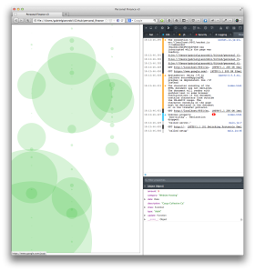


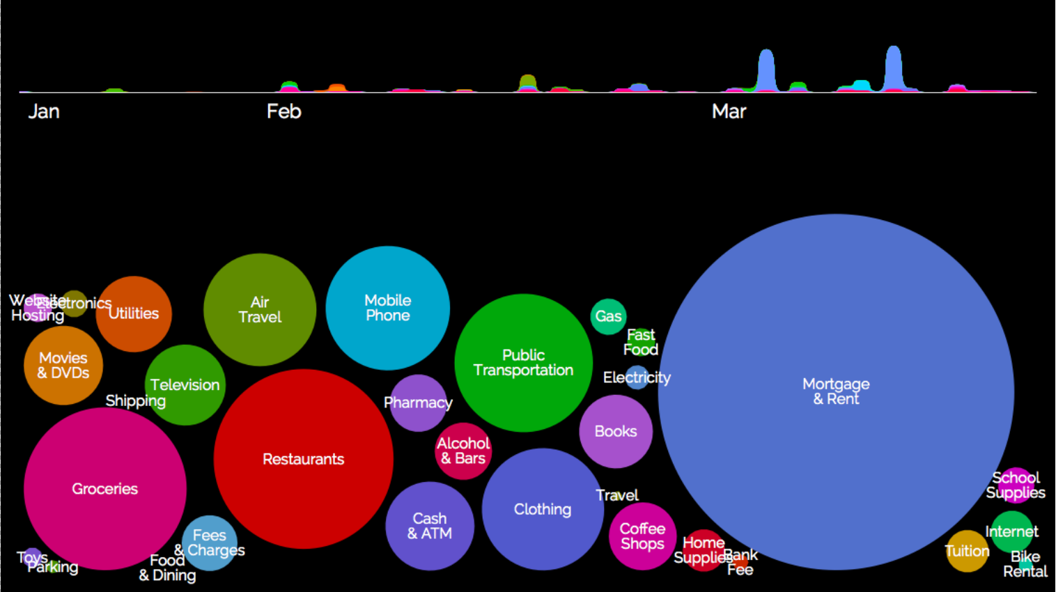
B) Though those experiments were useful in help me deal with the data, I felt like I was falling into the same technical-looking dataviz the I wanted to avoid. So I tried to change the direction completely. These sketches are trying to give the user an overview of the transactions, instead of a time x transaction representation:


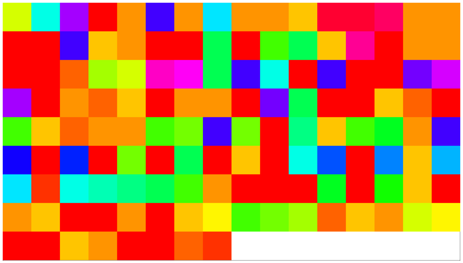
The bubbles are definitely not useful to show precise comparisons. Also, they can’t represent changes through time. Even so, I felt like they worked for a macro view of the data — and general comparisons.
I used a box2d, a physics engine, to position the bubbles and make them move.
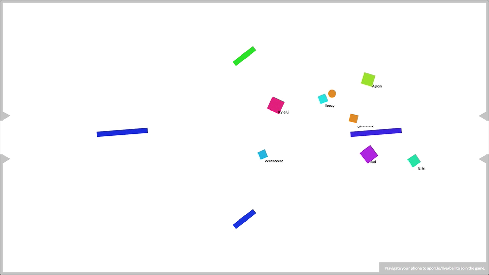
C) I went back to the timeline and tried to make it look better, too. My idea then was to make both visualizations in the same screen. The users could have a macro view of the data by looking at the bubbles. To see the detailed activity, he/she could expand the timeline and change the focus to it.
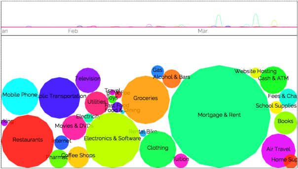
For that idea to work, I had to change the bubbles size when switching to the timeline view. This way, they become sort of buttons/legend to the timeline, instead of a visualization:
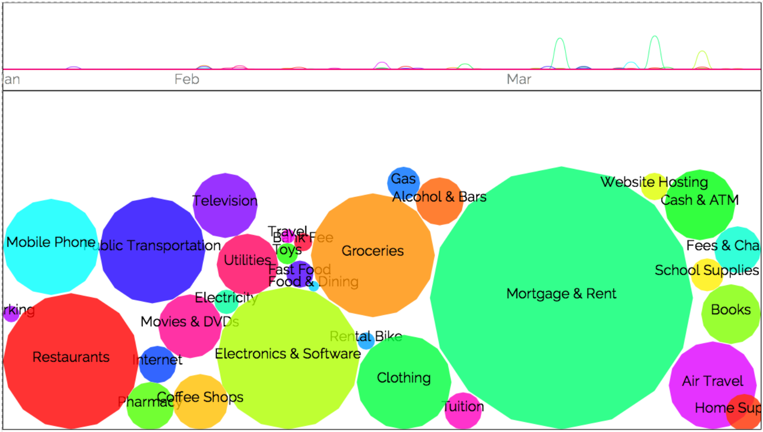
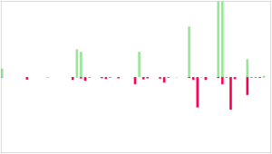
However, the line graph is not that easy to see, particularly when compared to the bubbles solid colors. So I changed the timeline to draw an are graph — which was very time-consuming. On the line graph I could just map the transaction amount to the y coordinate. On the are chart, though, I had to sum up all transactions for each day:

I experimented with a dark background, too: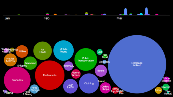
So far, the interaction was:
– click/touch on bubbles select/deselect it.
– click on timeline expands/collapse it


Final
I uploaded the last sketch and got some people to test it. Some problems I could quickly fix:
– add a button to switch between the timeline and the bubble view. Clicking on the timeline to switch the views proved to be misleading. Most people clicked thinking they would get details about the transactions, not expand it.
– add the money values to the bubbles. Simple and absolutely necessary.
– clicking on a category/bubble deactivates all other. Though the possibility of comparing different categories was useful, the work to deactivate 30 of them before that was just too much.I think the the final result still needs a lot of improvement. I’m not sure if having the 2 views on the same screen was really useful. Also, the timeline comparisons should allow for a time-span navigation — see full activity, months or weeks, for instance. And each of them should show the aggregated data for that time span.
To sum up, I don’t think this is the final form of the app. The interaction part is still very simple and doesn’t take in account the full app navigation. Also, the visuals are far from the simplicity of the bubble part, and a lot harder to compare at the same time. Anyway, I think it was a useful experiment in trying to visualize this data.

You can access the current version of the app here.
And download the code/check the other experiments here.